
SCANA Energy Website Redesign
Bringing a new brand to life through a scalable digital system.


OVERVIEW
Turning a brand refresh into a foundation for digital.
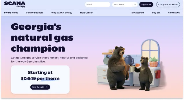
SCANA Energy was overdue for a rebrand when the company partnered with Landor to modernize and differentiate the brand. I was responsible for bringing that new identity into the website and digital experiences, working closely with marketing leadership, organizational strategy, and IT.
Rather than applying the new brand page by page, we used the project as an opportunity to establish SCANA's first formal digital design system. The result was a new foundation for creating more consistent experiences across design and development.
HIGHLIGHTS
MY ROLE
Translating the brand into a system designers and developers could use.
As the sole designer, I led the design system, UX/UI, wireframes, and page layouts for the new website experience. I worked directly with developers to define the visual rules, patterns, and conventions that would carry the new brand into production.
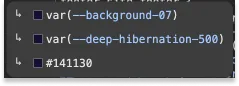
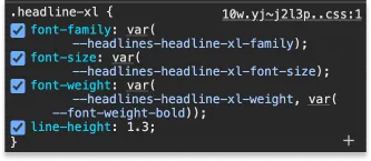
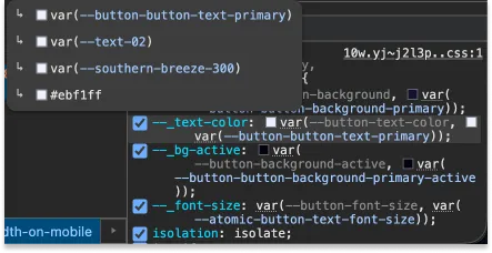
This included establishing foundational styles, design tokens, naming conventions, breakpoints, and reusable components in Figma, then working with development to keep those patterns aligned in Storybook.
THE CHALLENGE
There was a new brand, but no digital system behind it.
The previous SCANA website had little formal design direction beyond a single shade of blue and a typeface. There were no documented rules or reusable patterns to guide digital design, and the site's incremental development process made consistency difficult to maintain.
The new brand created an opportunity to change that. Instead of simply redesigning the existing site, we could establish a shared set of rules that would give design and development a common foundation for the new experience and future work.
DESIGNING APPROACH
Build the rules, then build the experience.
I worked with the development team to establish the first version of SCANA's digital design system before moving into full website production. We used an established UI framework as a starting point, then adapted its foundation to SCANA's new brand.
We defined everything from color, typography, spacing, and breakpoints to buttons and other foundational UI patterns. We also spent significant time developing a naming system that could bridge the language of marketing, design, and IT.
The resulting token structure connected raw values to meaningful design and component names. A change to a core brand value could therefore be made once and carried throughout the system rather than updated individually across the site.
Once the foundation was established, I used it to design the website experience. Because the patterns were already defined, page design became an exercise in applying and extending an established system rather than reinventing the interface with every screen.
THE DIGITAL EXPERIENCE
A new foundation for a more self-service experience.
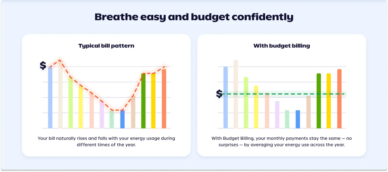
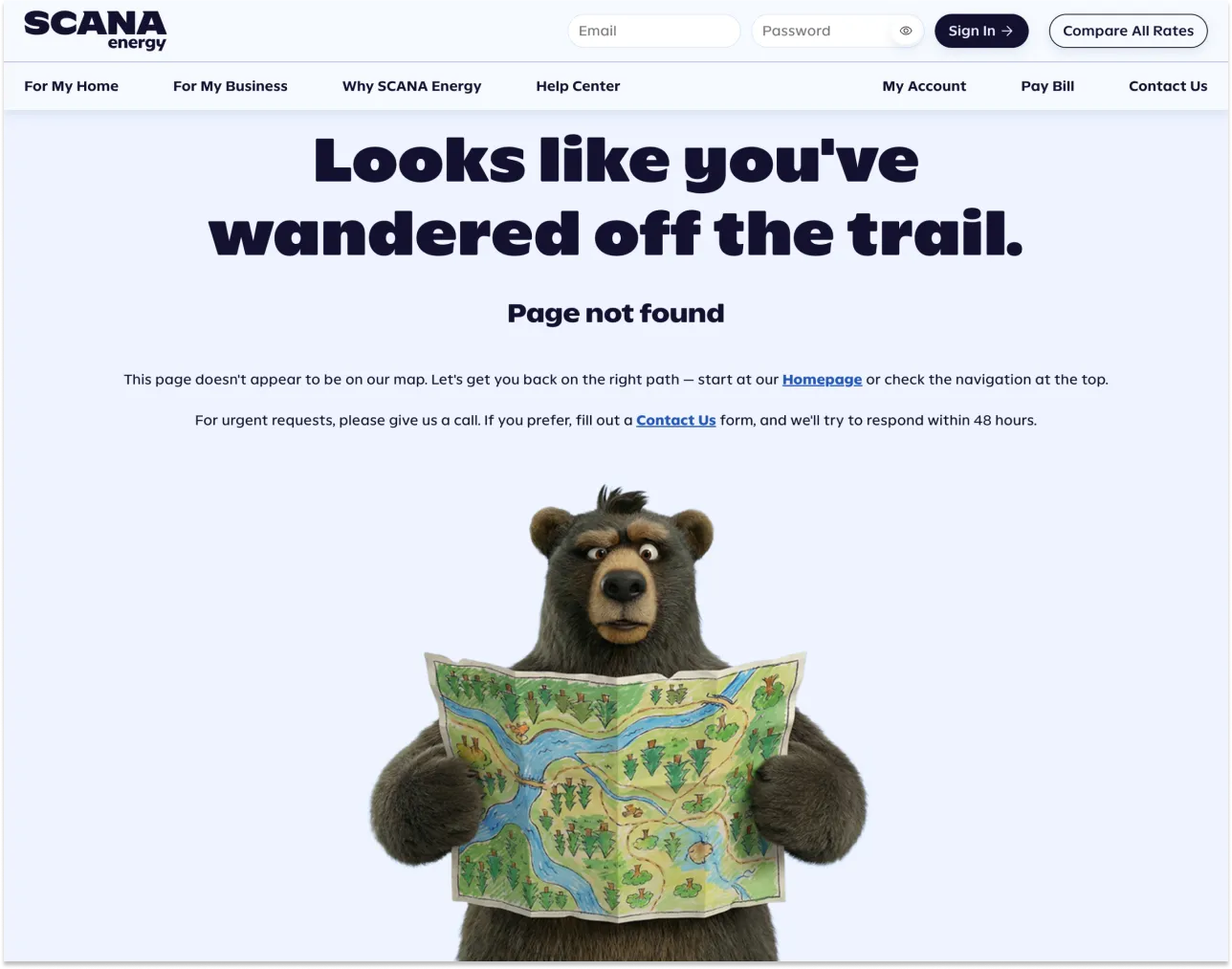
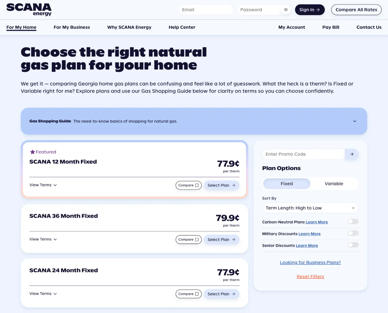
The new site was also designed around an important business goal: reducing reliance on the call center by giving customers more opportunities to find information, understand their options, and complete tasks themselves.
That meant creating a clearer, more useful experience around the products and services SCANA offered while bringing the new brand into every part of the customer journey.
OUTCOMES
A digital foundation designed to grow with the brand.
The project gave SCANA a new website and My Account experience built around a consistent visual and technical foundation.
More importantly, it established the company's first formal digital design system and created a shared language between design and development. The system was still in its early stages when I left the organization, but it was already being used to guide both the external website and My Account experience.
The work moved SCANA from a digital experience with very few defined rules to one with a foundation for consistency, reuse, and continued evolution.
Key Takeaways

Established SCANA Energy's first formal digital design system.
Worked directly with developers to align design and code.
Translated a Landor brand update into fresh digital experiences.
Designed the new website and My Account experiences.
Defined design tokens, naming conventions, and foundational UI patterns.
Created a foundation for more consistent, reusable digital work.